BOLD AND MODERN…
with a car silhouette integrated into the name, emphasizing speed, trust, and a hassle-free car buying experience. The strong use of light and dark blue on a black field suggests confidence and reliability.
SOPHISTICATED AND TIMELESS…
this monogram design features gold serif lettering over a marble background, evoking luxury, stability, and high-end real estate service. Sleek and elegant.
STRONG AND PROUD
Forged with an industrial edge, this logo features metallic textures, rivets, and a bold badge shape to reflect strength, craftsmanship, and blue-collar pride. A visual nod to custom fabrication and durability.
FRESH AND MODERN…
with circular energy, this logo combines vibrant green with clean typography to suggest movement, transformation, and holistic coaching. The name “Pivot360” reinforces the theme of perspective shift.
ELEGANT AND MINIMAL…
with a handwritten touch, this logo evokes inspiration, creativity, and collaboration. The golden spark icon adds a pop of brilliance and captures the energy of bright ideas taking flight.
ENERGETIC AND POWERFUL…
this logo uses a neon chartreuse background and a stylized bull mascot to project strength, playfulness, and personal empowerment. It’s gym branding with personality and grit.
INCLUSIVE AND VISIONARY…
this logo features a torch made of rainbow-colored flames—symbolizing both knowledge and pride. Designed to represent visibility, education, and advocacy for LGBTQ youth.
PERSONAL AND TRANSFORMATIVE…
this logo combines hand-lettered elegance with a portrait mark, underscoring the owner’s creative vision and boutique service approach.
TRADITIONAL AND PROGRESSIVE
The angled typography and cross elements reference the school’s faith-based roots while remaining traditional and grounded. Designed to balance tradition with academic momentum.
CONFIDENT AND CREATIVE…
this design features a simple san serif paired with a sweeping arc to represent upward financial growth. The purple palette conveys wisdom, wealth, and professionalism, and reflects the owner’s creative and fun side. This is not a stuffy CFP!

CLEAN AND CALMING…
this logo uses soft ripples in water to symbolize peace, clarity, and inner exploration. Covering many wellness modality practices, this brand focuses on well-being.
FORWARD AND CONNECTED…
the two-tone design features interlinked nodes to symbolize collaboration, focus, and holistic coaching. It’s about getting results with balance and intention.
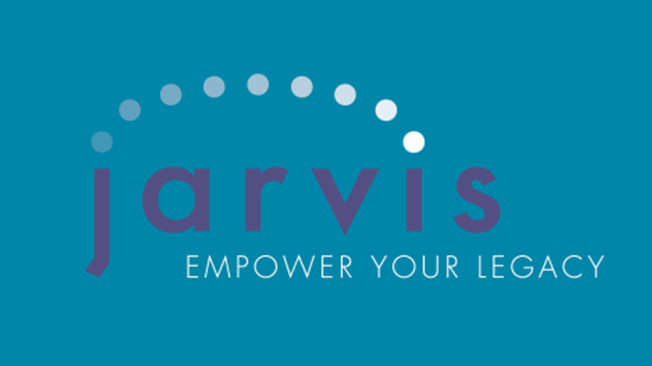
MODERN AND EMPOWERING…
this simple visual identity with bold lowercase typography, suggestd progress, innovation, and visionary support for clients planning their estate and how it affects the legacy they leave behind. The dots denote a back and forth transition, symbolizing the connection of generations.
PROFESSIONAL, WITH A PERSONAL TOUCH…
this floral-accented monogram softens the business tone with personality. It hints at custom solutions and a nurturing approach to small business administration.
